Latest posts
A masterclass in creating value
What’s going on at parkrun?
Virtue-signalling all the way to the bank
Bud Light: brand purpose or virtue-signalling?
The Coddling of the American Mind, by Greg Lukianoff and Jonathan Haidt
Belonging, by Owen Eastwood
Such a simple thing
The Long Win, and The Scout Mindset
The Cult of We by Eliot Brown and Maureen Farrell
Coffee and covid modelling
By theme
Marketing strategy
Insight & metrics
Innovation & inspiration
Brand & positioning
Marketing communications
Business purpose
Leadership
By industry sector
Financial services
Retail
FMCG
Technology & start-ups
Consumer services
Business to business
Other sectors
By type
Books
Comment
Quotes
Thought leadership
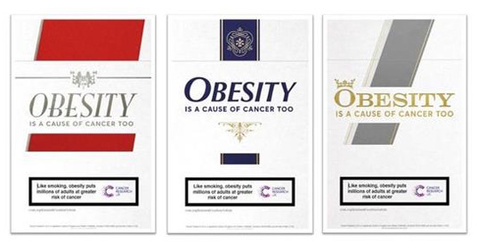
What do you see when you look at this poster? The visual language of cigarette packaging is so distinctive that even a non-smoker who has barely seen a fag packet up close in years knows what this is. But look again, and you see it’s not about tobacco. It’s about obesity. Genius, or confusing?
It’s universally accepted now that smoking increases cancer risk. Cancer charities want us to think of obesity in the same way. It’s a simple but controversial idea. So the first step is to establish the idea. Justifying it, and telling us what to do about it, comes later.
Good strategy, now to execution. The creative idea, using cigarette packaging, demands a lot of the passer-by. Great ads do involve the viewer. But posters work best as a snapshot. They need to be quickly and easily absorbed. Complex messages don’t land. (Tube ads which we read to pass the time are a notable exception.) The quick read from this ad is the familiar story, not the novel one. It’s an advertising version of the Stroop effect.
Graphics are so powerful that they will tend to override words. Advertising is first and foremost an appeal to the emotions. The battle of Christmas ads among UK retailers is primarily about who will win our hearts. This obesity campaign may eventually trigger some emotion – surprise, perhaps. But many people will see it and register the familiar message, smoking kills. No reason to take a closer look. It relies too much on the viewer’s willingness to engage, and the clever metaphor is as likely to mislead as to persuade.
It might still work, if the charity can afford to give it enough exposure. If they stick with it, then in time we’ll know what it’s saying. It helps, too, that their message on the health risks of obesity gets media attention without the fancy creative work. For that reason, I think they could have been a step further down the track of changing behaviour, if they’d skipped the clever posters and spent their money, and our attention, differently. There is a very powerful idea in here. But the execution risks being too clever. It’s a great illustration of how both strategy and execution matter.
Latest posts
A masterclass in creating value
What’s going on at parkrun?
Virtue-signalling all the way to the bank
Bud Light: brand purpose or virtue-signalling?
The Coddling of the American Mind, by Greg Lukianoff and Jonathan Haidt
Belonging, by Owen Eastwood
Such a simple thing
The Long Win, and The Scout Mindset
The Cult of We by Eliot Brown and Maureen Farrell
Coffee and covid modelling
By theme
Marketing strategy
Insight & metrics
Innovation & inspiration
Brand & positioning
Marketing communications
Business purpose
Leadership
By industry sector
Financial services
Retail
FMCG
Technology & start-ups
Consumer services
Business to business
Other sectors
By type
Books
Comment
Quotes
Thought leadership
